Business Analytics and Statistics
Today’s competitive environment forces the firms to keep on changing their activities so that they can know about the strategies that are going on and the kind of technologies they are utilizing to satisfy their customers effectively.
It is significant for the firms to know the buying behavior, pattern, beliefs and thought patterns of the customers so that they can know about the likes and dislikes of the customers in context of the products and services respectively.
The forms required can also be identified in regard of the product mix and the sales of the Good Harvest on the sunshine coast by the help of data analytics. Good Harvest is a health food shop which deal in growing and selling organic food to the customers (Good Harvest, 2017).
It helps to sell the organic food all over the country and has a huge customer base. What all kinds of indications of the data analytics approach for resolving the complications in the business can be identified by the help of this assignment.
Problem Definition and Business Intelligence Required
There are various issues that can be observed in every business. The main problem that is identified in this business enterprise is that the organic food products sales are decreasing as well as there is a rise in the cost of goods sold.
On the business life cycle the company stands on the introductory stage currently and is fully focused on decreasing the cost of its products and at the same time also increasing the profit as well as the sales of the company.
The data set further is also used to identify the performance of the product and the sales pattern of the company which is associated with the sales and the product mix of the company. The ANOVA test, t-test, correlation, and the descriptive test which is included in the statistical data analysis is also adopted the data of the company.
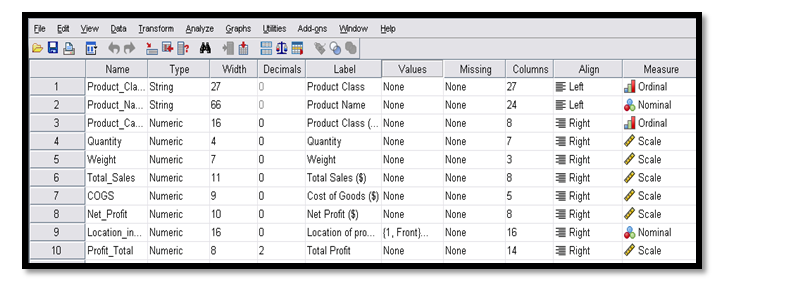
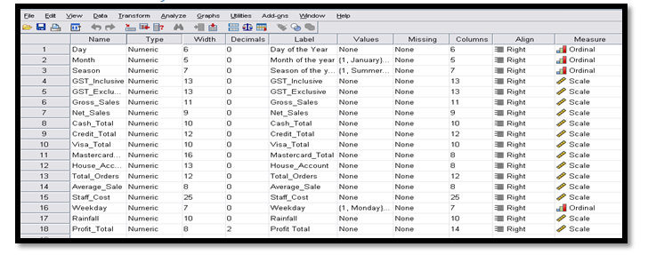
The table which is represented below shows the data set for the sales and the products of the company.
Data set illustrated below appropriately:


It can be illustrated from the above table represented that the data of sales represents the ordinal variable including day, weekday, month and season whereas on the other hand the data of product represents two ordinal variables that is the product class and also the category.
There are some questions which are mentioned below. These questions will assist the business enterprise to control the on-going issues in the business.
Q1. Identify the top/worst selling products in respect to sales? Is there any difference found in payment method?
Q2. In different months of a year, is any difference found between sales and gross profits?
Q3. Identify the difference in sales performance on the basis of where product located in retail shop? And also how this sales performance affects both revenue and profit of the company?
Q4. Identify the differences in their sales performance as based on different seasons?
- How this difference in sales performance will relate to rainfall and profits?
Additional questions:
Q5. Demonstrate the variations that occur in average sales in different months of the year?
Q6. Demonstrate the variations that occur in the gross profit margin between different seasons?
Q7. Demonstrate the variations that occur in average sales between different seasons?
Visualize Descriptive Statistics
(Data of product) Descriptive Statistics
Table C.: (Data set of product)
| Descriptive Statistics |
|
|
N | Sum | Minimum | Mean | Maximum | Std. Deviation |
| Product Class (number) | 1034 | 15464 | 1 | 14.96 | 30 | 8.515 |
| Quantity | 1034 | 74348 | 1 | 71.90 | 3769 | 212.400 |
| Weight | 209 | 16156 | 0 | 77.30 | 2913 | 242.323 |
| Total Sales ($) | 1034 | 382540 | 0 | 369.96 | 17276 | 1014.719 |
| Cost of Goods ($) | 1034 | 212203 | 0 | 205.22 | 8573 | 561.072 |
| Net Profit ($) | 1034 | 170338 | 0 | 164.74 | 8703 | 482.106 |
| Location of product in shop | 1034 | 3218 | 1 | 3.11 | 5 | 1.526 |
| Total Profit | 1034 | 1.70E5 | .00 | 1.6473E2 | 8702.93 | 482.10651 |
| Valid N (list-wise) | 209 |
(Data of Sales) Descriptive Statistics
| Descriptive Statistics |
| N | Mean | Minimum | Std. Deviation | Maximum | Sum | ||
| Day of the Year | 366 | 183.50 | 1 | 105.799 | 366 | 67161 | |
| Month of the year | 366 | 6.51 | 1 | 3.456 | 12 | 2384 | |
| Season of the year | 366 | 2.50 | 1 | 1.117 | 4 | 915 | |
| GST Inclusive | 366 | 114.42 | 0 | 48.723 | 271 | 41876 | |
| GST Exclusive | 366 | 930.56 | 0 | 303.827 | 2492 | 340583 | |
| Gross Sales | 366 | 1044.97 | 0 | 326.285 | 2642 | 382460 | |
| Net Sales | 366 | 1014.26 | 0 | 313.986 | 2370 | 371220 | |
| Cash Total | 366 | 404.29 | 0 | 153.643 | 1195 | 147969 | |
| Credit Total | 366 | 584.80 | 0 | 228.860 | 1407 | 214036 | |
| Visa Total | 366 | 555.85 | 0 | 244.870 | 1407 | 203441 | |
| MasterCard Total | 366 | 22.09 | 0 | 67.823 | 399 | 8086 | |
| Rainfall | 365 | 3.98 | 0 | 9.811 | 63 | 1452 | |
| House Account | 366 | 37.39 | -264 | 113.204 | 1113 | 13684 | |
| Total Orders | 366 | 55.54 | 0 | 15.844 | 129 | 20327 | |
| Average Sale | 358 | 18.52 | 8 | 3.985 | 61 | 6631 | |
| Staff Cost | 366 | 248.69 | 170 | 52.418 | 351 | 91022 | |
| Weekday | 366 | 4.00 | 1 | 1.998 | 7 | 1463 | |
| Profit Total | 366 | 30.7098 | -33.98 | 30.05661 | 271.97 | 1.12E4 | |
| Valid N (list-wise) | 357 |
Q1. Identify the top/worst selling products in respect to sales? Is there any difference found in payment method?
To identify the top/worst selling products in context of the sales, the Pareto Principle is been used. The Pareto Principle means that 80/20 rule which means that 80% of the output from a given circumstance is determined by the 20% of the input. In this, the Pareto principle states that 80% of total effect is emerged from 20% of the cause in a particular event.
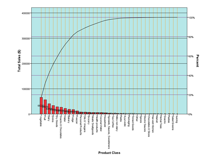
The Pareto Principle is demonstrated below, which is in association of the class of the sales as well as the product:

Pareto diagram is been presented above which helps to illustrate that the 80% out of the total sales which is presented on the y-axis and the x-axis depicts the products of the company which are the top selling ones. At the same time, the values which are presented on the x-axis represent the worst products of the company.
Additionally, the products such as the vegetables, snacks, dairy products, etc which has high sales accounts to the 80% of the total sales. The remaining 20% of the sales account for the worst products sold by the company which includes grocery, spices, fridge, etc (Brynjolfsson & Simester, 2011).
The payment method is quite helpful to make a comparison or differentiation by adopting the t-test:
| One-Sample Test |
| Test Value= 0 |
| t | df | Mean Difference | Sig. (2-tailed) | 95% Confidence Interval of the Difference | ||
| Lower | Upper | |||||
| Cash Total | 50.340 | 365 | 404.287 | .000 | 388.49 | 420.08 |
| Visa Total | 43.427 | 365 | 555.849 | .000 | 530.68 | 581.02 |
| Credit Total | 48.885 | 365 | 584.798 | .000 | 561.27 | 608.32 |
| MasterCard Total | 6.232 | 365 | 22.094 | .000 | 15.12 | 29.07 |
| House Account | 6.318 | 365 | 37.388 | .000 | 25.75 | 49.02 |
Regression table is been demonstrated above. This regression table will further depict that p value for each of the variable is different payment methods is zero. P value is the probability of identifying the most extreme results when the null hypothesis of any study question is true. The regression table presented above also signifies that the significance value of p is < 0.05. It means that there is a significant variation in the methods of payment.
Q2. In different months of a year, is any difference found between sales and gross profits?
Regression analysis will be done that will further assist in recognizing the variation in the sales as well as the gross profit within the various months of a specific year:
Table F.: Regression analysis (sales in different months)
It can be demonstrated from the above represented regression table that, 0.221 which is the obtained p-value is more than 0.05. This result signifies that there prevail no differences in the sales within various months of a specific year. At the same time, on the other hand it is seen that the ANOVA test is used to analyse the differences that dwells in the various months as well as the gross profits (Ni & Fan, 2011).
Table G.: Regression Analysis (gross profit in different months)
The above demonstrated regression table shows that there prevails a significant variation in the gross profit in various months of a specific year. The reason that exist behind this is that the value of p is less than 0.05 been a combined form.
Q3. Identify the difference in sales performance on the basis of where product located in retail shop? And also how this sales performance affects both revenue and profit of the company?
A Pareto curve is one which includes bars as well as line graph, where single values are demonstrated in descending order by the help of bars and the cumulative total by the help of line. Here, the Pareto curve assists to identify the variation that prevails in the sales performance which shows the relationship in the product’s location and its performance.
Image ii): Pareto curve (sales performance & product location)
The picture of the Pareto curve represented above helps to depict that there prevail a variation in the product’s performance as well as its location. At the same time, it is observed that the products which are located near the shop are having high sales as compared to those products which are located outside the product location (Stäblein, et al., 2011).
Additionally, the Pareto curve image represented below demonstrates the relationship that prevails within the profit as well as the product’s location:
Image iii) Pareto curve (total profit & product location)
The Pareto curve image presented above illustrates that the location of the product which is in front give more revenue and profit to the company as compared to the ones which are been located outside. At the same time, this analysis also helps to gain a thorough outlook of the location of the given product which has a high impact on the profit as well as the revenue.
Q4. Identify the differences in their sales performance as based on different seasons?
The regression analysis has been done below to depict the variation that prevails in sales performance:
Table H.: Regression Analysis (sales performance in different seasons)
The above represented regression table is demonstrating that the p value been 0.153 is greater than the sign significant value. There is also no significant variation in the sales performance.
- How this is linked up with the rainfall as well the profits?
Table I.: Correlation Analysis (rainfall and profit)
The correlation analysis table demonstrated above signifies that there prevails no connection in the rainfall as well the profits. The reason behind it is that there exists no correlation within both of them.
At the same time, the correlation table presented above also states that there is a positive correlation among both of them which is 0.008 but still not significant. Further, there is no effect on the profits when any change is employed on the rainfall (Jamali, et al., 2011).
Additional questions:
Q5. Demonstrate the variations that occur in average sales in different months of the year?
The variation that prevails in the different season’s average sales can be depicted by the help of the regression analysis.
Table J.: Regression Analysis (average sales of different months)
From the regression analysis been conducted above helps to illustrate that the p-value which is been 0.03 is less than 0.05 (Zhu & Zhang, 2010).
Q6. Demonstrate the variations that occur in the gross profit margin between different seasons?
The variation that prevails in the different season’s gross profit margin can be illustrated by the help of the regression analysis.
Table K.: Regression analysis (gross profit in different seasons)
From the above ANOVA table it can be demonstrated that the value of p is less than 0.05. This further depicts the overall data sets of gross profit. At the same time, it illustrates that there prevails a variation in the margin of gross profit due to change in the seasons (Alipour, 2011).
Q7. Demonstrate the variations that occur in average sales between different seasons?
The ANOVA test is been conducted under the regression analysis to review the variation in the average sales of the various season’s.
Table L.: Regression Analysis (sales of different seasons)
The regression analysis that has been conducted above demonstrates that the p-value which is obtained 0.176 is greater than 0.05. It further illustrate that prevail no variation in the average sales of the various seasons.
The study conducted above illustrated that the Good Harvest Shop delivers organic food of top quality to its customers. There are various products such as vegetables, snacks, dairy products, etch which are having a high demand by the customers.
The company also utilizes the various available payment methods for its customers so that they can buy any product according to their needs. During the analysis it was found that certain products kept near the front area gives high profits as compared to those kept outside. There are variations observed sometimes in the profit and revenues in various months of a year in the company.
It can be recommended that company should focus on how to target more customers that might help it to increase its market share. Company can do this by identifying the locations where there exists a high demand of the company’s products.
The company can also use payment methods such as credit cards. An attractive and sound marketing strategy can also be adopted by the company to further bring a boost in its sales and profits. It can also introduce the new discount offers, schemes, for promoting its products.
Alipour, M. (2011). Working capital management and corporate profitability: Evidence from Iran. World Applied Sciences Journal, 12(7), 1093-1099.
Brynjolfsson, E., Hu, Y., & Simester, D. (2011). Goodbye pareto principle, hello long tail: The effect of search costs on the concentration of product sales. Management Science, 57(8), 1373-1386.
Good Harvest (2017) Retrieved from: http://www.goodharvest.com.au
Jamali, S., Seaquist, J., Ardö, J., & Eklundh, L. (2011). Investigating temporal relationships between rainfall, soil moisture and MODIS-derived NDVI and EVI for six sites in Africa. Savanna, 21(3), 547-553.
Ni, Y., & Fan, F. (2011). A two-stage dynamic sales forecasting model for the fashion retail. Expert Systems with Applications, 38(3), 1529-1536.
Stäblein, T., Holweg, M., & Miemczyk, J. (2011). Theoretical versus actual product variety: how much customisation do customers really demand?. International Journal of Operations & Production Management, 31(3), 350-370.
Zhu, F., & Zhang, X. (2010). Impact of online consumer reviews on sales: The moderating role of product and consumer characteristics. Journal of marketing, 74(2), 133-148.


