COMP1800 Data Visualisation Assignment Sample
Module Code And Title : COMP1800 Data Visualisation Assignment Sample
1.0 Introduction
Data visualisation is one of the most prominent ways to interpret data as it allows the user to easily compare and analyse the data that is otherwise very difficult to comprehend theoretically. Visualisation of data is essentially a graphically represented form of the original data that has been recorded in a tabulated form or any other forms. It is easy to interpret the data without the use of data visualisation when the data is relatively small and compact, however, when the data is relatively large and redundant, it becomes very hard for the user to analyse it properly without the use of pictorial representation.
Data visualisation makes it easier to deal with big data which is currently the ongoing trend in the modern world where large chunks of data are being analysed with the help of data visualisation tools. Data visualisation generally makes use of different colours in order to display the data which are easily read by the user owing to the sensitivity of human eyes and their perception in distinguishing colours and thereby properly analysing the data in a more realistic and easy way.

The culture of visual art is not new as humans have been constantly appreciating it since ages, some of the examples being drawings, sculptures, videos and other forms of visual arts that are widely acclaimed by the audience.
Hence, the data visualisation can also be termed as another form of visualisation art that makes it easier to draw down data from enormous spreadsheets that can easily bore anyone from analysing the trend. A good data visualisation helps in underlining the story behind a vast amount of data by removing the unnecessary data which is redundant and only highlighting the useful information to convey the proper message to the audience who witnessed the data visualisation.
2.0 Background
ChrisCo is a highly successful company that has its operations taking place all across the Uk. ChrisCo has become successful in the Uk owing to its large volumes of sales that are witnessed in the venues it has relatively established in the different regions of the country.
Due to its multitude of operations in its venues that are densely distributed in the Uk taking place on a daily basis, a large volume of data is recorded and stored on a daily basis that is constantly been stacked in the computers systems of the company and other storage devices (Ahn, 2019).
The data that is normally stored includes the website data, sales data, venue data, client data involving the various customers visiting the venues on a daily basis and following loyalty card schemes introduced in order to visit these venues owned by the ChrisCo company. The only data which is accessible currently is the daily visitor report and the features of the venues that are located in different areas. There are a total of 40 venues of ChrisCo company which record the daily visitors individually.
3.0 Tools used
Data visualisation is not confined to a one single type rather they can be of various types. Each type of data visualisation has their own unique characteristic standing it apart from the others. Some of the basic types of data visualisations are the “charts”, “tables”, “graphs”, “maps”, “infographics”, “dashboards” and others.
These basic forms of visualisations are improved into more advanced types of visualisation such as box charts, gantt charts, bubble charts, heat maps, histograms and others which are the main benefits of using different types of tools for the purpose of data visualisation. These tools which are utilised for the purpose of data visualisation have their own sets of properties differentiating them from one another creating different forms of visualisation from data adequately (Fahad and Yahya, 2018).
Some of the tools that are commonly used for the purpose of data visualisation are tableau, powerbi, r programming, SAS, SPSS, python programming and many others. In this particular case of visualising the data of ChrisCo company the python programming tool would be used.
4.0 Discussion
It is important to discuss the visualisations that were made using the python programming tool to better realise their importance regarding the data recorded by the ChrisCo company.
The first visualisation which can be seen in the figure depicts a histogram plot for the ChrisCo company data on the average age of visitors that regularly visits its venues in the different regions of the Uk.
This particular visualisation is used since the age of visitors that frequent these stores generally gives the idea as to what age group does the ChrisCo company truly attracts the most such as younger audience, olderly and adults giving an interpretation of the products of ChrisCo company that are more popular (Stančin and Jović, 2019). Histogram has been used for the purpose of better comparison of the adjacent fields of data and give the idea of who is the highest performing among all.
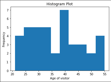 Figure 1: Histogram plot for visitor’s age (Source: Created in python)
The histogram plot for the average age of visitors visiting the stores or venues of the ChrisCo indicates that the people in their 40s visit the most in terms of other age groups which are also relatively high. There is a downward trend witnessed in the case of olderly people which is expected given their age and their restricted ability to visit regularly due to limited mobility.
The younger group of people are also seen to be quite keen on the products and services of ChrisCo that can be gathered from the chart. The anomaly can be seen in the age group lying to the 35 to 40 years of age that may centre specific and demographics of the region with the less number of people in that particular age group (Siebinga, 2021). Otherwise, it can be gathered that ChrisCo is quite successful for people in the 25-40 years of age.
The next visualisation that can be seen in the figure below is a scatter plot. Scatter plot has been particularly used for depicting the distribution of the daily visitor data for the various different venues of the ChrisCo company. As it is known that the ChrisCo company boasts of various different venues that record a multitude of visitors on a daily basis, it becomes difficult to visualise these amounts adequately with proper visualisation.
The ideal visualisation that can help reiterate the different amount of visitors and show correlation is the scatter plot which is why it has been selected and used to visualise the data of daily visitors for the different venues of ChrisCo company.
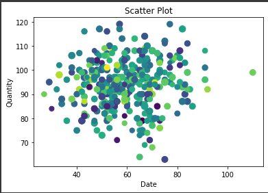 Figure 2: Scatter plot for daily visitors (Source: Created in python)
The scatter plot for the daily visitors visiting different venues across different dates suggest that the magnitude of values are rather random as it is expected. The factor seasonality and correlation is witnessed in this data wherein it can be seen that the amount of daily visitors for the venues coalesce across a particular date where the venues see the most amount of footfall compared to the other regions where the different venues of the ChrisCo record the least amount of footfall by the venue visitors (Kim et al., 2019).
This revelation of the certain dates of the ChrisCo company venues are highly useful for the company as it might help reveal the seasonality in business and the need for greater attention during these times where the number of visitors are soaring.
The next visualisation which is selected is the detailed distribution plot wherein the dataframe with all the different venue features is utilised. This particular visualisation which mainly comprises line plots is utilised so as to compare the data of various features of the venues that are recorded by the ChrisCo company.
The use of line chart visualisation allows for the clear and precise comparison of different features relating with the values. It shows how the different data contorts and deviates suggesting which of these features are most variable compared to the others that is hard to depict using any other form of visualisation.
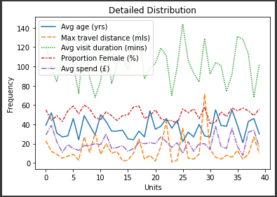 Figure 3: Detailed distribution for venue features (Source: Created in python)
Now, to address this particular visualisation shown in the figure, it can be seen that the field with the highest deviation in the ChrisCo company venue data is the average visit duration of the customers in the venues of the company. The deviation is represented in the forms of sharp dips and rises in the line plot showcasing crests and troughs of the figure which can be used to directly infer that they are highly unpredictable (VanderPlas et al., 2018).
It can be seen from the figure that the maximum travel distance for the people to reach the venues from the central is also a little variable indicating the need for planning of ideal location of venues of ChrisCo company for more adequacy of the customers. Average age seems also a slightly variable with proportionality of females and average spendings on each of the venues remaining largely stable with less anomaly in the visualisation data.
The next visualisation which has been used for the data is a mixed chart data which is a combination of a histogram and line plot data with labels for greater recognition of trends in the data. The reason for using this particular visualisation is that it incorporates 2 vital fields of data that is average expenditure of the visitors performed on the venues and the proportionality of women as visitors in this trend to identify whether or not women as visitors contribute the most towards the average expenses that are done in the venues (Bilogur, 2018).
It is a common notion that women are more likely than men to indulge in shopping and buying materials from a stores which can be revealed using this particular visualisation.
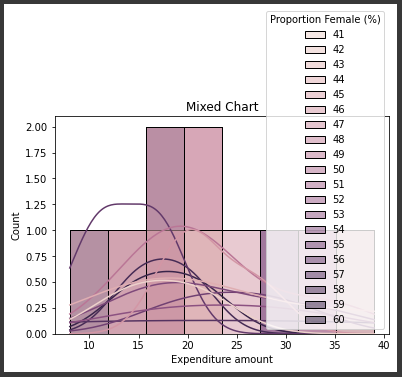 Figure 4: Mixed chart for venue expenditure and gender (Source: Created in python)
From referring to the above figure, it is seen that the expenditure amount is although somewhat inclined to the proportionality of women but does not wholly depend on it as there are some parts where the expenditure is fairly high where proportionality is low. It does reveal that although products inclined for women perform particularly well for ChrisCo as well as the desired services, the entire expenditure into the venues are not solely guided by a high number of women visitors.
Pie chart was selected as one of the most important visualisations for the ChrisCo company as it helped in understanding the different shares of venues in terms of the average expenditure spent by the visitors. The average spendings data was depicted in the form of a pie chart so as to make us realise which of the venues was performing the worst and which of them the best, which is otherwise hard to find through other visualisation (Ertug et al., 2018).
Pie chart in the form of percentages was the ideal choice of visualisation as it enabled the proper comparison of different venues in a more detailed scale than was possible. Although line chart and bar chart would have been good for this representation, they would not have been this accurate in terms of the data scale to depict the findings of the spendings on each of the venues.
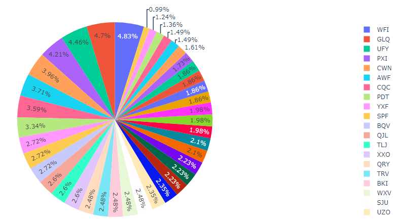 Figure 5: Average spending pie plot (Source: Created in python)
The information that is revealed via this visualisation is that some of spendings recorded in the venues is quite large as compared to the others. This visualisation indicates which of the venues will require more attention as compared to the others on the basis of their poor performance. The order of the performance in terms of the pie chart is also stated in the right hand side index which shows that the venue WFI contributes the most while the venue UZO contributes the least to the company of ChrisCo showing direct reference to the average expenditure on the venues by their visitors.
Correlation plot is used as one of the visualisations of the ChrisCo company data since it aids in the inference of the presence of any direct correlation between any particular field of the data. One of the utmost necessity of finding relationships between the variables or the attributes that are present within the data is by using the concept of correlation. The correlation between the attributes are better understood with the help of scatter plots that are produced using adequate tools which in this particular case is python (Waskom, 2021).
The three different attributes which are used for determining their correlation were the maximum travel distance, average visiting time and the age of visitors for getting the maximum idea regarding the venue characteristics of the ChrisCo company and find out if any form of relationship existed between them. It becomes easier to control and modify the parameter settings for the venues to make it better if all the dependencies are properly known.
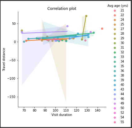 Figure 6: Correlation plot on venue distance (Source: Created in python)
Referring to the figure shown above correlation can be realised based on the age of the visitors including the visit duration and the maximum travel distance of the venues from the central. It is seen that the visit duration of the customers in the venues in the ChrisCo company is highly distributed while the maximum travel distance for the venues are least distributed.
The visit duration is slightly affected by the travel distance of the venues but only in the extreme ends where the travel distances are very high (Pandey and Panchal, 2020). As for the age of the visitors it can be inferred from the chart that the millennials as well as the older people have a higher visiting duration as compared to the ages lying between 25-45 which can be understood as they are normally pretty busy, hence showing the relation of age of the visitors and their respective visiting hours in the venue.
All the previous visualisation plots which were selected were mainly uninteractive plots but now the subsequent visualisations which were developed in the python tool were interactive visualisation plots. For the development of these types of visualisation plots, bokeh and plotly libraries were apparently used out of which only the plotly visualisation were selected.
The next visualisation which is shown in the figure was selected since it showed a scatter plot in a 3d space showing the correlation of multiple variables at ones which were mainly the venues and their daily visitors in this case.
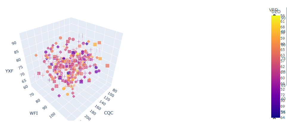 Figure 7: Interactive 3d scatter plot for daily visitors (Source: Created in python)
The overall distribution of the daily visitor data can be realised from this particular visualisation. It can be easily seen that there is a presence of a particular trend in the daily visitors spread across the dates as they seem to coagulate somewhere in the middle (Narechania et al., 2020). For each of the venues it is seen that the coagulation of points is a little different indicating the seasonal preference of customers are a little different for all venues.
The last visualisation which was selected is a line distribution plot for the daily visitors in the venues of the ChrisCo company that shows how the daily footfall of the visitors in the venues fluctuated. A slider with zoom function was introduced in this plot to magnify the differences in the footfall for better realisation.
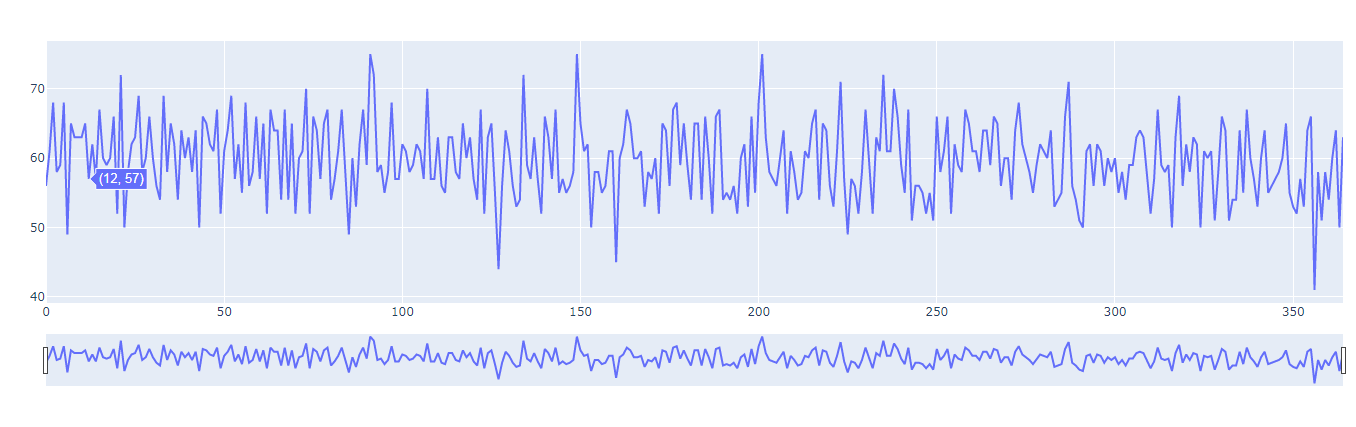 Figure 8: Interactive line chart for daily visitors on venues (Source: Created in python)
This plot revealed how the average daily visitors in the venues increased and decreased over the lapse of time showing their interest in the shopping of products in the ChrisCo company at certain periods of time which can be used as a leverage for greater business.
5.0 Critical review
It is important to review the practices that were employed in order to produce the relevant visualisation for the ChrisCo company to understand their adequacy. Certainly, only the best practices were utilised for carrying out the data visualisation of the data to avoid any form of error in the data. At first the data was retrieved from the source using the desired id number conforming to the different details of the venues of the ChrisCo company, a total of 40 of them that are located all around the Uk.
After retrieving the data, their formats were checked and then they were adequately processed using the python programming tool in the google collabo. Adequate library for reading the excel data was used in the python programming tools such as pandas and numpy library (Benitez et al., 2019). The excel data was read and correspondingly 2 data frames were formed for the analyses wherein the daily visitor data was integrated in a single one and the rest of the data was defined into sets and merged to form another dataframe.
The data frames after their definition were checked for any null values which were found to be none. Correspondingly, the different visualisation libraries of the python programming tool namely matplotlib, seaborne, bokeh and plotly were used adequately to produce different visualisations from both the data frames.
A total of 9 different visualisation plots were produced as a result of experimenting with different fields of data to produce the most significant result for the ChrisCo company data. Interactive plots were produced with adequate functions of marker controls to allow freedom to the user. Similar graphs were not produced as several forms of visualisation were used to display the best outcome for the data.
6.0 Conclusion
The necessary analysis of the data associated with the 40 different venues of the ChrisCo company was done using the python programming tool. With the help of these visualisations, some critical discovery was made on the business of ChrisCo company. It was found that there was some contribution of female visitors for the ChrisCo company which they can use to introduce more female products to attract them. A need for better planning of the venue location was identified based on the variability of the travel distance observed for the company. It was identified that the trend of daily visitors were a little seasonal which they can promote by using discounts using those seasonal periods.
Reference List
Books
Ahn, Y.Y.Y., 2019. Data visualization.
Journals
Fahad, S.A. and Yahya, A.E., 2018, July. Big data visualization: allotting by r and python with GUI Tools. In 2018 International Conference on Smart Computing and Electronic Enterprise (ICSCEE) (pp. 1-8). IEEE.
Stančin, I. and Jović, A., 2019, May. An overview and comparison of free Python libraries for data mining and big data analysis. In 2019 42nd International Convention on Information and Communication Technology, Electronics and Microelectronics (MIPRO) (pp. 977-982). IEEE.
Siebinga, O., 2021. TraViA: a Traffic data Visualization and Annotation tool in Python. Journal of Open Source Software, 6(65), p.3607.
Kim, J., Kim, M., Yu, H., Kim, Y. and Kim, J., 2019. Effect of data visualization education with using Python on computational thinking of six grade in elementary school. Journal of The Korean Association of Information Education, 23(3), pp.197-206.
VanderPlas, J., Granger, B.E., Heer, J., Moritz, D., Wongsuphasawat, K., Satyanarayan, A., Lees, E., Timofeev, I., Welsh, B. and Sievert, S., 2018. Altair: interactive statistical visualizations for Python. Journal of open source software, 3(32), p.1057.
Bilogur, A., 2018. Missingno: a missing data visualization suite. Journal of Open Source Software, 3(22), p.547.
Ertug, G., Gruber, M., Nyberg, A. and Steensma, H.K., 2018. From the editors—A brief primer on data visualization opportunities in management research. Academy of Management Journal, 61(5), pp.1613-1625.
Waskom, M.L., 2021. Seaborn: statistical data visualization. Journal of Open Source Software, 6(60), p.3021.
Pandey, K. and Panchal, R., 2020. A Study of Real World Data Visualization of COVID-19 dataset using Python. International Journal of Management and Humanities (IJMH), 4(8).
Narechania, A., Srinivasan, A. and Stasko, J., 2020. NL4DV: A toolkit for generating analytic specifications for data visualization from natural language queries. IEEE Transactions on Visualization and Computer Graphics, 27(2), pp.369-379.
Benitez-Hidalgo, A., Nebro, A.J., Garcia-Nieto, J., Oregi, I. and Del Ser, J., 2019. jMetalPy: A Python framework for multi-objective optimization with metaheuristics. Swarm and Evolutionary Computation, 51, p.100598.
Punasya, D., Kushwah, H., Jain, H. and Sheikh, R., AN APPLICATION FOR SALES DATA ANALYSIS AND VISUALIZATION USING PYTHON AND DJANGO.
Roberts, W., Williams, G.P., Jackson, E., Nelson, E.J. and Ames, D.P., 2018. Hydrostats: A Python package for characterizing errors between observed and predicted time series. Hydrology, 5(4), p.66.
Lafuente, D., Cohen, B., Fiorini, G., García, A., Bringas, M., Morzan, E. and Onna, D., 2021. Introduction to Machine Learning for chemists: An undergraduate course using Python notebooks for visualization, data processing, data analysis, and data modeling.
Zulkower, V. and Rosser, S., 2020. DNA Features Viewer, a sequence annotation formatting and plotting library for Python. Bioinformatics.
Know more about UniqueSubmission’s other writing services:

I may need your help. I tried many ways but couldn’t solve it, but after reading your article, I think you have a way to help me. I’m looking forward for your reply. Thanks.
I don’t think the title of your article matches the content lol. Just kidding, mainly because I had some doubts after reading the article. https://accounts.binance.com/tr/register?ref=FIHEGIZ8
Thank you for your sharing. I am worried that I lack creative ideas. It is your article that makes me full of hope. Thank you. But, I have a question, can you help me? https://accounts.binance.com/ro/register?ref=53551167