Descriptive statistics on age gender and money spent among the people
The following assignment deals with the Descriptive statistics on age, gender and money spent among the people in the given sample. In addition to this, the statistical tools of frequency distribution, histogram, ogive and coefficient of variation have also been discussed in the following report.
2.0. Descriptive statistics (Refer to Ms Excel)

The descriptive statistics on age and gender are shown in the below sections:
2.1. Descriptive statistics on ‘age’
The descriptive statistics on age is shown as follows:
| Mean | 41.61 |
| Median | 41 |
| Mode | 51 |
| Minimum value | 11 |
| Maximum value | 94 |
| Standard deviation | 16.77293093 |
| Standard error | 1.677293093 |
| Variance | 281.3312121 |
| Kurtosis | 0.130308522 |
| Skewness | 0.316643515 |
| Range | 83 |
(Refer to Ms Excel)
From the above descriptive statistics on age, it has been understood that the mean age of the given sample is 41.61 where the minimum age is eleven (11) and the maximum age is ninety four (94). As the standard deviation in this case is a large one (16.77), hence it can be said that the values in the data set are far away from the average value.
2.2. Descriptive statistics on ‘gender’
The descriptive statistics on gender is shown as follows:
| Females | 44 |
| Males | 56 |
From the above descriptive statistics on gender, it has been found that the number of male people (56) is much greater than the number of female people (44).
3.0. Coefficient of variation for ‘age’ for the entire dataset (Refer to Ms Excel)
The coefficient of variation for age for the total data set is given by the formula:
CV (age) = Standard deviation (age) / Expected Return (age) = 16.77293093 / 41.61 = 0.403098556
3.1. Interpretation of the coefficient of variation
A coefficient of variation is a statistical computation of the scattering of data points in a data series in the region of the average. It gives the representation of the proportion of the standard deviation to the average value, and it is a very helpful measure for drawing a comparison between the extents of disparity from one data sequence to another data series, even when the average values are significantly dissimilar from each other (Reed, Lynn, and Meade, 2002). In the above case, it means that the coefficient of variation is close to its mean age, that is, the age is consistent.
4.0. Descriptive statistics on ‘money spent’
| Mean | 149.463 |
| Median | 143.4 |
| Mode | 184.55 |
| Minimum value | 5 |
| Maximum value | 323.8 |
| Standard deviation | 72.10143 |
| Standard error | 7.210143 |
| Variance | 5198.616 |
| Kurtosis | -0.53187 |
| Skewness | 0.287402 |
| Range | 318.8 |
(Refer to Ms Excel)
From the above descriptive statistics on age, it has been understood that the average amount of money spent by the given sample is 149.46 where the minimum amount of money spent is five (5) dollars and the maximum amount of money spent is 323.8 dollars. As the standard deviation in this case is a large one (72.1), hence it can be said that the values in the data set are far away from the average value (Bonner, 2018).
4.1. Frequency distribution, histogram, and Ogive (Refer to Ms Excel)
The frequency distribution, the histogram and the Ogive curve for the amount of money spent by the given sample if people are shown in the below sections:
The frequency distribution and the cumulative frequency for the amount of money spent by the given sample of people is shown in the following table:
| Bins array | Frequency | Cumulative frequency |
| 5 | 1 | 1 |
| 25 | 2 | 3 |
| 45 | 2 | 5 |
| 65 | 5 | 10 |
| 85 | 9 | 19 |
| 105 | 10 | 29 |
| 125 | 12 | 41 |
| 145 | 11 | 52 |
| 165 | 13 | 65 |
| 185 | 5 | 70 |
| 205 | 5 | 75 |
| 225 | 6 | 81 |
| 245 | 7 | 88 |
| 265 | 6 | 94 |
| 285 | 1 | 95 |
| 305 | 4 | 99 |
| 325 | 1 | 100 |
(Refer to Ms Excel)
The following graph shows the histogram for the above frequency distribution:
(Source: created by author)
The above histogram reveals that the data points in the lower classes are very less in frequency, for example, one in the first class, two in the second and the third classes and five in the fourth class. On the other hand, the frequencies are higher, for example, 10, 12, 11 and 13 in the middle classes but it again declines in the latter classes to six, four and one.
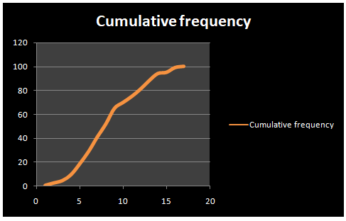
The Ogive curve for the above frequency distribution is shown in the following graph:
(Refer to Ms Excel)
(Source: created by author)
The above Ogive curve reveals that the relative slopes from every point to the consecutive point are indicating greater increases, that is, it shows a steep slope. Ogive plots imply cumulative frequency plots (Chatfield, 2018).
5.0. Analysis of ‘age’ and ‘money spent’ with the help of a scatter plot
From the above scatter plot diagram, it can be seen that exists no consistent relationship between the age groups and the amount of money spent by the people in the age group. The reason in this is that people like to spend the money as per their income and their interest to spend the money.
There are also some other reasons such as low information, high income, etc that also creates the difference in the amount of money spent by the people in the age group. So, it can be determined that the outcome of this graph is appropriate and effective.
6.0. Cross tabulation tables (Refer to Ms Excel)
The pivot tables have been used for the analysis of the proportion of money spent by the female and people, which are shown in the following sections:
| Row Labels | Sum of Money Spent |
| FEMALE | 6598.95 |
| MALE | 8347.35 |
| Grand Total | 14946.3 |
(Refer to Ms Excel)
The above pivot table shows that the proportion of money spent by the male people is much higher than the proportion of female people in the given sample (Grech, 2018). The reason in this is that there are different countries in which, male person like to do the job instead of female people.
It is because there are different works related to the home that are also completed by the women so men are preferred to work to do. In like manner, men are the major familiar with the market and for them; it is also easy to handle to the all work related to the market. Because of this, it can be determined that money spent by the male people is much higher than the proportion of female people.
6.2. Marital status and money spent
| Row Labels | Sum of Money Spent |
| Married | 7544.25 |
| Single | 7402.05 |
| Grand Total | 14946.3 |
(Refer to Ms Excel)
The above pivot table shows that the proportion of money spent by the married people is slightly greater than the proportion of single people in the given sample. The reason in this is that there are not much responsibility on the single people that is why, the expanses of the single people is also limited.
But at the same time, after the marriage, there are different responsibilities that are followed by the people towards their family, wife, etc and increase the expanses of the firm as well.
As well as, there are also some expenses to survive related to food, shelter, etc that also increase the expanses of the people after the marriage. Because of this, it can be interpreted that the expanses of the married people is slightly greater than the proportion of single people
7.0. Proportion of money spent by each age group (Refer to Ms Excel)
The proportion of money spent by each of the age groups is represented in the following pie chart:
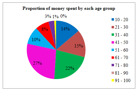
The above pie chart shows that the maximum amount (27 %) of money has spent by the people in the age group 41 to 50 years. The reason in this is that people always try to keep safe the amount for their future and the stage of the old. It is because they know that in the old stages, there will be a need for the money to the people.
It is because that time they will not be able to earn the money so that always try to save the money and spend the money in different things such as marriage of girl and boy, complete their spiritual needs, etc. Because of this, it can be determined that most of the people spend the money in the in the age group 41 to 50 year. On other hand, from the above graph, it can also be stated that lowest amount (0 %) of money spent is by the people in the age group 81 to 90 years.
The reason in this is that they are probably not able to spend the money at this stage and they just spend the last moments of their life as well as spend all day in the spiritual things. That is why, it can be stated that (0 %) of money spent is by the people in the age group 81 to 90 years. Apart from this, from the above graph, it can be determined that31 to 40 years, 21 to 30 years and 10 to twenty years are the major age group in which, people like to spend the money.
There are different reasons behind this and in this, the one of the major reason is that in this age, people are very much concerned about to earn the money and that is why they look to get the best and effective job in the market. There are also very lack of responsibility on them that make it free to do the expanses freely.
As well as, they strength and the mindset of the people is very much clear about the earning and the spending. Because of this, it can be determined that the second (22 %), third (15 %) and fourth (14 %) groups of people who spend the largest amounts are the people in the age groups of 31 to 40 years, 21 to 30 years and 10 to twenty years. The second (1 %), third (3 %) and fourth (8 %) groups of people who spend the smallest amounts are the people in the age groups of 91 to 100 years, 71 to 80 years and 61 to seventy years.
The reason in this is that they don’t have the need to do the expenses and always try to avoid the expanses. Because of this, there is a limited ratio of the money spending in the age groups of 91 to 100 years, 71 to 80 years and 61 to seventy years.
From the above report, it has been concluded that as the values of the standard deviations are large, hence the values in the data set are far away from the average value. It has also been seen that the money spent by the married people is greater than the unmarried people and the male people spend more than the female people.
At the same time, it can also be concluded that there are different age group of people they spend the money in the market as per their age group and in this, it is also concluded that (22 %), third (15 %) and fourth (14 %) groups of people who spend the largest amounts are the people in the age groups of 31 to 40 years, 21 to 30 years and 10 to twenty years..
Bonner, M.D., 2018. Descriptive statistics. Police Abuse in Contemporary Democracies, p.257.
Chatfield, C., 2018. Statistics for technology: a course in applied statistics. Routledge.
Grech, V., 2018. WASP (Write a Scientific Paper) using Excel–10: Contingency tables. Early human development.
Reed, G.F., Lynn, F. and Meade, B.D., 2002. Use of coefficient of variation in assessing variability of quantitative assays. Clinical and diagnostic laboratory immunology, 9(6), pp.1235-1239.

The next time I read a blog, I hope that it won’t fail me as much as this particular one. After all, I know it was my choice to read, but I genuinely thought you’d have something interesting to talk about. All I hear is a bunch of moaning about something that you could possibly fix if you weren’t too busy looking for attention.
https://twrd.in/3L7YXU7
You made some really good points there. I checked on the internet to find out more about the issue and found most individuals will go along with your views on this website.
https://fj.wpcookie.pro
Thanks so much for the blog article.Thanks Again. Keep writing.
https://undress.vip/
5025 apartments rentberry scam ico 30m$ raised apartments lynnwood wa
https://suba.me/