Foundation Skill in Data Analysis
- During drawing the table, the selection range of the data should be appropriate and effective to enhance the reliability of the table
- The selection of the data should be based on the meaning full manner
- The heading and title chart should be presented in the sequence and effective manner
- The flow of the information in the table should be top align with the left and right align
- In the table and graph, the data should be maintained in the same number of decimal values in all cell numbers (Boers, 2017)
- In drawing the graph and table, the width of class should be created in the understandable format
- In the graph, stack bar graphs should be ignored in the context of the tow segments
- At the time of drawing the table and graph, all the information should be presented in the readable format
- Graph must be presented in the appropriate size and selection of the color should be based on effective representation (Duch, 2012)
- In the graph and table, all the numerical values should be determined and written in the actual value instead of the indication alphabets
- The data in the table and graph should be presented in the easy format where reader can easily understand
- The starting of the Horizontal Axis and Vertical Axis should start from 0 (Zero)
- Title should be mentioned on the top of each graph and table
- In the context of the 2D graph, Scale axes should be presented on the both sides
- In order to maintain the clearance, the size of the sample should be defined in the advance (Eckardt et al., 2016)
- The presentation of the table and graph should in the simple and effective manner
- The name of the title should demonstrate the clear information on the graph
- The label of each graph and chart should be based on the distinguish
- Graph, table and chart should be developed with the aim of self explanatory
- Large information should be presented in the different tables with the aim of making the easy for reader
- It is also important that in order to avoid the error, the selection of the right chart and graph should appropriate (Evergreen, 2017)

- Line chart
- In order to represent the long series with the different mark lines, this chart is used
- During the drawing the chart, relationship should be clear between the two categories of the data. (Ouzts, 2013)
- 5-6 lines graphs should be ignored for the attractiveness
- Multi line chart should be clear in the formatting show that comparison can be developed
- During the drawing the chart, the relationship between the data and time should be clear to avoid any error (He et al., 2012)
- Column chart
- In the context of the Column chart, for marking the each category some unities should include
- In order to display the data in the effective manner, label and legends should be presented clear
- In the column chart, for labeling the data axis title should be determined
- Line chart should determine the trend in the market on the particular time period (Hinton & McMurray, 2017)
- Pie Chart
- In the pie chart data should show all the scenario and situation
- Pie char should able to compare the two different variables
- Pie chart should demonstrate the bubbles in the graph
- The selection of the chart should able to understandable format
- In order to present the clearance in the pie chart, 2D chart should be preferred instead of 3D (Kubina et al., 2017)
- Pie chart should able to demonstrate the group activities in the clear manner
(Source: Wesfarmers, 2016)
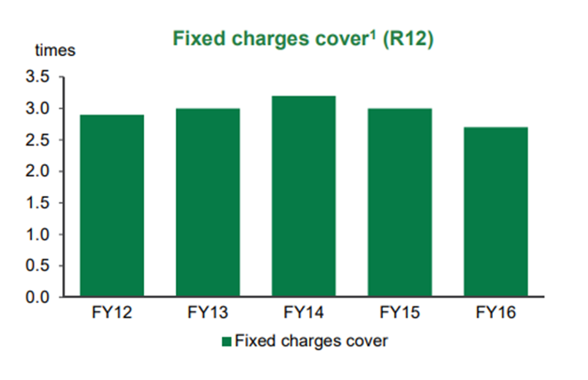
The above figure demonstrates the 2-D column chart. By the help of chart an increase and decrease in the fixed charges cover that can be seen between the financial years 2012 to 2016. This graph shows the clear title of the graph that is fixed charges cover by company. However, this graph includes the clear labels but there is lack of legends of the graph according to 23(B).
This graph even doesn’t demonstrated horizontal and vertical axis title as well as no gridlines that help in determining the category of data. In addition, this graph also mentioned a note below which clearly states that how TRIF is calculated (Wang, 2014). Each column bar represented on graph is associated with percentage value rather than actual value. This representation of data creates difficulty for reader to understand and interpret the data as per criteria 10.
(Source: Wesfarmers, 2016)
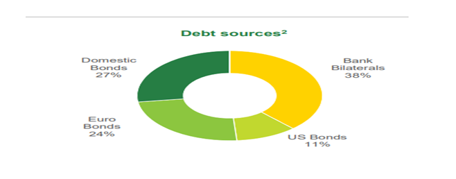
Pie chart is to represent the categories of data in different sources of the debt. The above figure 2, demonstrates a clear pie chart foe debt sources. This pie chart easily compared with the different debt sources. This comparison is easily visualized in this graph which will help the reader to understand and interpret the data outcome. In addition, this graph also presented in 2D pie chart form instead of 3 D form as mention in category of 24 (d).
(Source: Wesfarmers, 2016)
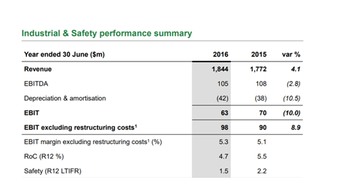
This above figure is a summarized form of table that represents the industry and safery performance summary. The table should be self – explanatory as mentioned in 19th criteria. Moreover, the illustrated text of the graph should be in readable text format as mentioned in 8th criteria. This table graph will help reader in understanding and identifying a clear ratio of gender composition in different job classification.
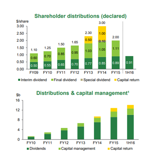
Figure 4: Grouped Column Bar Graph
(Source: Wesfarmers, 2016)
This graph represents shareholder distribution and capital management of the company. This is 2-D dimensional side horizontal grouped graph which don’t contain any axes on the graph side by side. However, this graph contains both title and legend that help in describing the financial years by representing a bar as per 23 (a) (c) criteria mentioned (Boers, 2017). This graph doesn’t provide a clear understanding and meaningful picture about data because each year bar is not marked with per million hours.
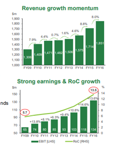
(Source: Wesfarmers, 2016)
This above figure states revenue growth momentum that helps in measuring the direct and indirect measures in short-term and long-term remuneration of incentive.
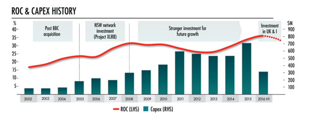
Figure 6: Multiple column bar graphs
(Source: Wesfarmers, 2016)
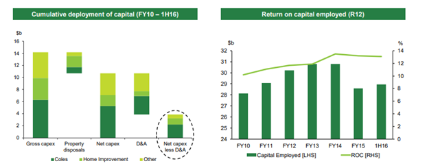
Figure 6 displays the ROC & CAPEX history. The table heading and subheading is been presented as per the 3rd criteria. Each and every graph or chart also contains a Title as per the 13th criteria. The title on Graph or chart had conveyed a clear overall message as per the 17th criteria.
The Table, graph or chart are self- explanatory in effective manner as per the 19th criteria. Each part of graph or chart is not labeled in order to distinguish categories as per the 18th category. Graph should include legends for representing a graph so that each category of data can be easily and uniquely identified which is not been provided as per the 9th criteria (Duch, 2012).
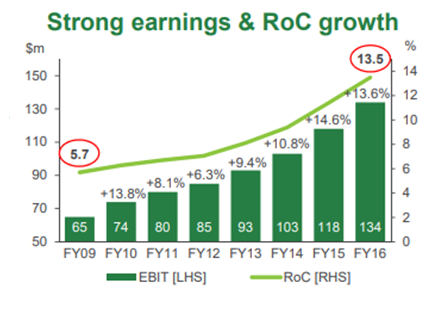
(Source: Wesfarmers, 2016)
Figure 7 displays the strong earning & Roc growth. The table heading and subheading is been presented as per the 3rd criteria. The Table, graph or chart are not self- explanatory in effective manner as per the 19th criteria. Each part of graph or chart is not labeled in order to distinguish categories as per the 18th category. Graph should include legends for representing a graph so that each category of data can be easily and uniquely identified which is not been provided as per the 9th criteria (Evergreen, 2017).
(Source: Wesfarmers, 2016)
The above figure: 8 presents that column bar graph does not mention X and Y axis. But as per the 14 criteria, it is necessary to include 2D graph on both sides. It is identified that column bar graph is fully labeled as each part is explained in a distinguish category form.
As per the criteria 19, the column graph is self-explanatory in an effective manner. Moreover, both horizontal and vertical starts from zero and the column graph include the title. Thus, this graph indicates clear facts and figure and allows reader to easily understand and interpret the graph (Hinton & McMurray, 2017).
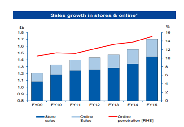
(Source: Wesfarmers, 2016)
Figure 9 shows that both horizontal and vertical line starts from zero. It also contains the title in the form sales growth in stores & Online. It is also found that bar graph also does convey overall message through its line and trend form (Wang, 2014).
Bar graph is labeled from each part by distinguish categories. Due to this, the bar lines is reflecting as a self-explanatory. But this bar graph does not include the footer for presenting the additional information. At the same time, there is no sub-heading is presented.
It is followed the criteria 20 which stated that present large data should be into different tables so that reader could easily understand and identify the data. Based on this, it is analyzed that bar graph follows various criteria in a effective manner but at the same time, there are some limitation that also exist (Ouzts et al., 2013). Such limitation needs to be correct so that reader could interpret the bar graph in a proper manner.
(Source: Wesfarmers, 2016)
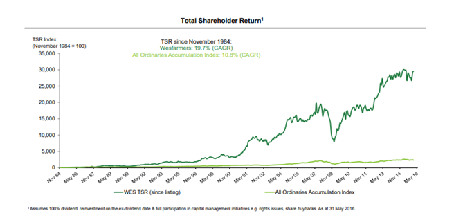
Figure 10 demonstrates that time series over 33 years contains a clear title as per 13th criteria that shows the trend of investment in form of dividend. There are implied horizontal axes of time as per time period i.e., 8 years and the value of investment is presented on vertical axes.
Hence, this graph demonstrates a clear picture Total shareholder return (Evergreen, 2017). As per 22nd (e) criteria, this graph clearly serves the main purpose of displaying each investment trend over a period of time effectively by efficiently comparing trends with different series of data value.
(Source: Wesfarmers, 2016)
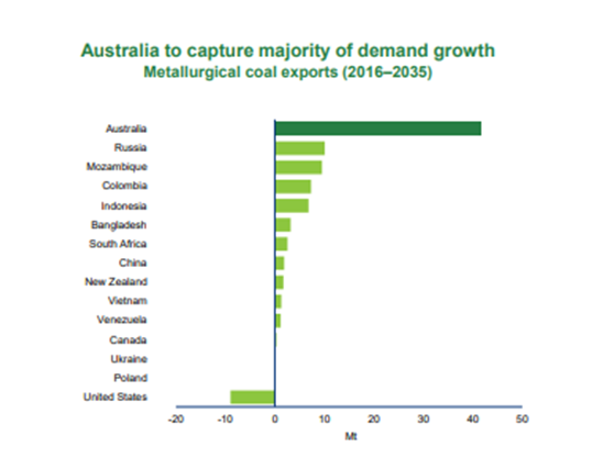
This graph is stacked bar chart that is used for comparing different categories of data in efficient manner. The sample size is not provided as mentioned in 15th criteria, in order to determine that how percentage for each category is derived. The horizontal and vertical axes are provided in this graph that help in interpreting the data easily as mentioned in 12th criteria number.
In addition, this graph contains a title above which clearly conveys the message that what graph is all about as mentioned in 17th criteria (Ouzts et al. 2013). But moreover, it is advisable to use separate bar column when there are more than two variables or set of data in order to avoid confusion and error as mention in 7th criteria.
(Source: Wesfarmers, 2016)
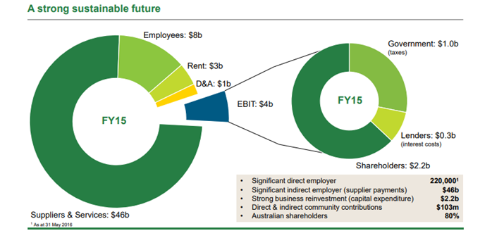
This figure illustrated that this donut pie chart has self-explanatory title that defines a clear picture as per 13th criteria. But at the same time, 24(e) criteria, demonstrates that this pie chart also used for displaying group stung sustainable future. The slices of pie chart are labeled properly and this makes easier for comparing the data as mentioned in criteria.
Moreover, this graph mentioned that all slices are mentioned in an ordered format as per criteria mentioned in 24th (c) (Wang, 2014). But on the other hand, this graph doesn’t mentioned labels properly which help the reader to understand and identify the category of data in each slice as per criteria 9th.
Boers, M. (2017) SP0091 Data visualisation: tables and graphs for publication and presentation.
Duch, W. (2012) GRMS Or Graphical Representation of Model Spaces: Vol. 1 Basics (Vol. 42). Germany: Springer Science & Business Media.
Eckardt III, R.W., Wolf Jr, R.G., Shapiro, A., Rivette, K.G. and Blaxill, M.F., Boston Consulting Group Inc, (2016) Method for providing a network graphical representation of database records. U.S. Patent 9,262,514.
Evergreen, S. D. (2017) Presenting data effectively: Communicating your findings for maximum impact. USA: SAGE Publications.
He, P.A., Wei, J., Yao, Y. and Tie, Z. (2012) A novel graphical representation of proteins and its application. Physica A: Statistical Mechanics and its Applications, 391(1-2), pp.93-99.
Hinton, P. R., & McMurray, I. (2017) Presenting Your Data with SPSS Explained. USA: Taylor & Francis.
Kubina, R. M., Kostewicz, D. E., Brennan, K. M., & King, S. A. (2017) A critical review of line graphs in behavior analytic journals. Educational Psychology Review, 29(3), pp. 583-598.
Ouzts, T., Fortier, P. and Guzak, C.J., Microsoft Corp (2013) Method for graphical representation of a content collection. U.S. Patent 8,549,434.
Wang, P.C. ed. (2014) Graphical representation of multivariate data. UK: Elsevier.
Wesfarmers (2016) 2016 Full-year Results; Briefing Presentation. [Online] Available at: https://www.wesfarmers.com.au/docs/default-source/asx-announcements/2016-full-year-results-briefing-presentation.pdf?sfvrsn=0
Wesfarmers (2016) 2016 Strategy Briefing Day. [Online] Available at: http://www.wesfarmers.com.au/docs/default-source/results-presentations/2016/2016-strategy-briefing-day-presentation.pdf?sfvrsn=2 (Assessed: 10 April, 2018)
